Easier-to-use component controls

Custom actions
You can now add action buttons and any other custom UI to the right sidebar, to provide user-friendly ways for your editors to interact with and manipulate the components you’ve registered.
These “custom actions” are shown alongside your prop controls. The difference with current prop controls is that actions aren’t necessarily associated with any single prop. However the action can read and write props, and have access to performing other operations on the project.
Examples include:
Buttons to easily add/remove slides in a Carousel component
Buttons or select dropdowns to navigate around said Carousel component
A button to pop open a more advanced configuration modal
An entire right sidebar section that takes over the prop configuration
There are two types of actions you can render: buttons and custom React components. These all have access to performing a variety of other actions on your document. This includes: showing modals, refreshing data from Plasmic Query, and adding/removing elements to code components slots.
Easier-to-use Slider and Tabs
With custom actions, we’ve made components from the component store easier to use, including the Slick Slider and Ant Tabs.


Visual product search for commerce integrations
We’ve given our commerce components ease-of-use enhancements as well!
When you add a Product Box for a commerce integration such as Shopify, you'll now see your entire product catalog shown visually for you to select the right item.
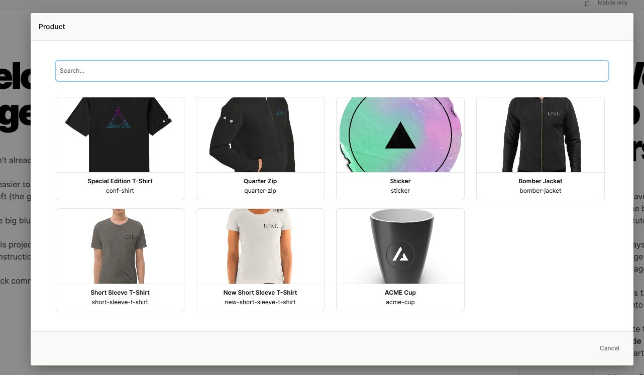
This includes the ability to search through your entire product catalog, no matter how large.
Behind the scenes, this is enabled by a new type of component prop control called 'cardPicker'. You can use this for your own components as well. Learn more in the docs!
And more
Can now set canonical URLs on pages (without manually plumbing the metadata into Next.js head).
Can now set custom icons on Ant Collapse components.
Can now see who published versions of a project.
Using Ant components now results in smaller bundle sizes.
Jump back into Plasmic to play with the latest changes!