Instant previews and prototypes, CSS filters
Instant previews and prototypes, CSS filters

Instant previews and prototypes
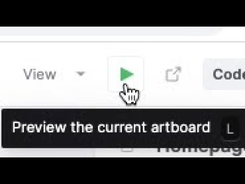
We have introduced a new live preview mode!
Links fully work, so you can now do click-through prototyping of your site.
And every screen you see in preview mode is itself linkable—simply copy the URL from your address bar and share it to start getting feedback on your website.
A new toolbar along the top lets you jump to any page/component and switch to viewing any variant, without leaving preview mode.
You can also pop-out a new live preview, which shows no Plasmic Studio chrome and will behave like a normal website. This makes it possible to instantly share these links for user-testing, or even to preview from your mobile device.
Furthermore, you can switch between variants—transitions between these will just work, letting you preview and prototype things like microinteractions between the different states of your components:
(Open this simple microinteraction example project.)
Check out the new preview mode and let us know what you think!
New right pane
The right pane is central to interacting with Plasmic. We have just launched a revamped, streamlined right pane! The aim is to make it less busy, less sprawling, and more approachable—without hindering speed for those users who are ramped-up.
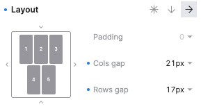
For instance, you can now set layout more visually and intuitively:
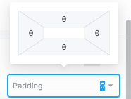
Padding and margin controls are tucked away:
And many more changes!
Please play with it and share your feedback, on this and on other areas of the Plasmic Studio UX!
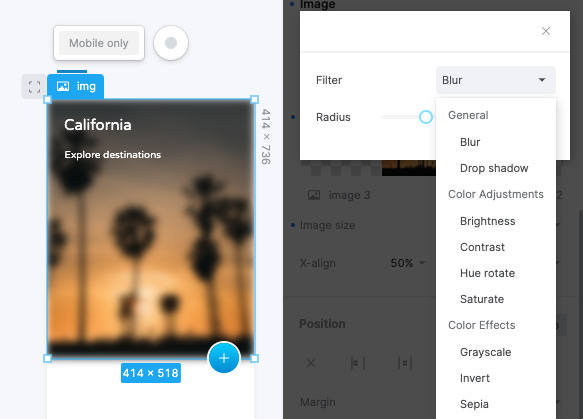
Filters
You can now add many different types of CSS filters to your elements, everything from blurs to drop shadows:
Keep telling us what other styling features you’d like to see!
And more
Keyboard shortcuts for changing font size: Cmd+Shift+< and >.
Keyboard shortcuts for changing font weight: Cmd+Alt+< and >.
Now automatically uses smarter, better-matching default fallback fonts.
Can now use vh sizes in your designs without elements taking up your full artboard height—you can set a virtual screen size for your artboards to determine what 100vh should be shown as.
Can now define “presets” for code components. Before, when Plasmic Studio users insert (say) a Material UI Button Group, they would get an empty box, and would need to assemble something more recognizable manually. With presets, developers can ensure that inserting a Button Group will also include a few Buttons, each containing some text. So presets are basically “templates” or full trees of elements that users will always get when they insert a code component.
When you have images inside a component, you can now expose their shown image (the src) as a prop on the component.
Code components can now take “choice” prop types (shown as a select).