Making Plasmic easier and faster

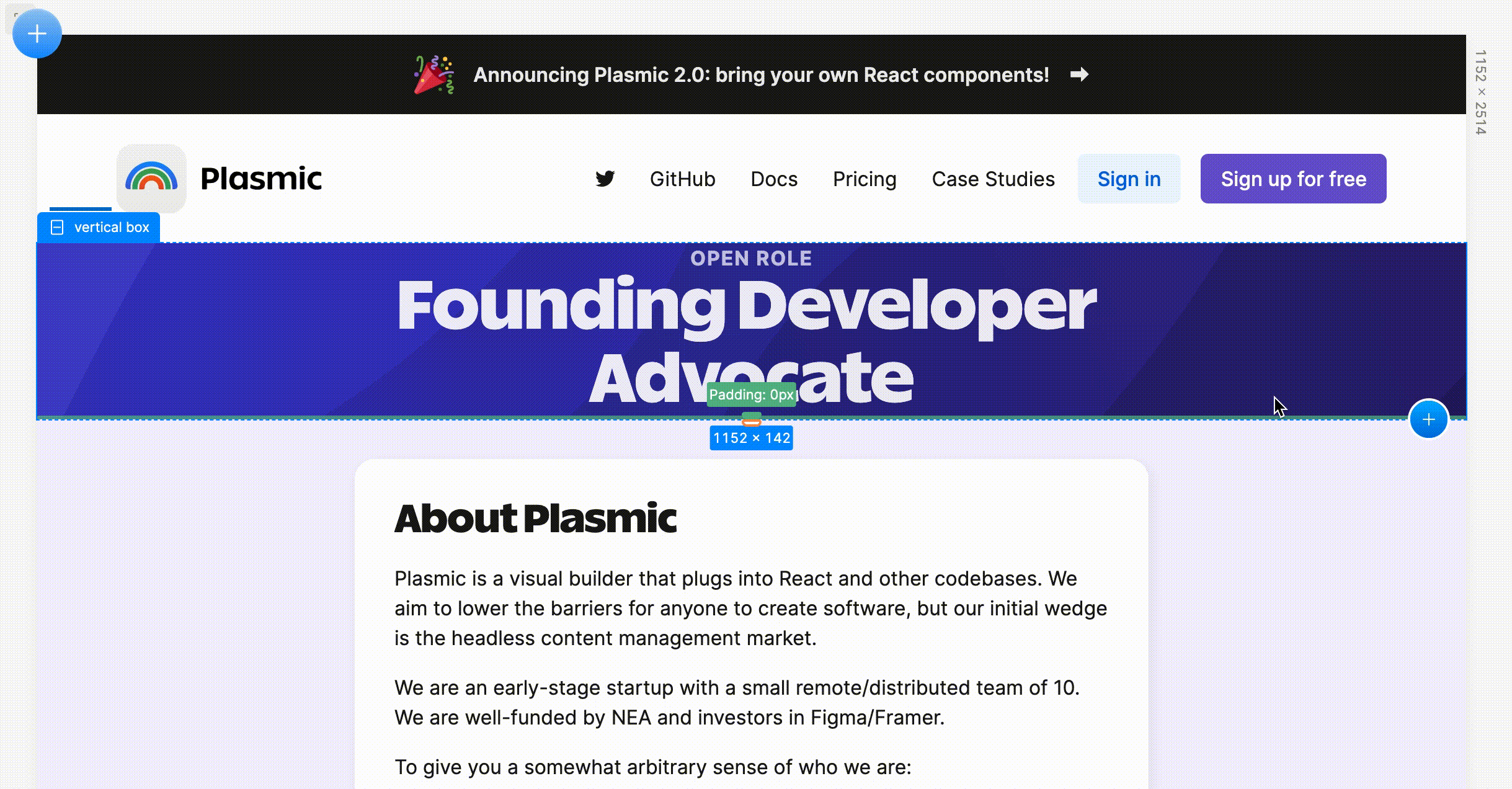
Hiring founding developer advocate!
See our open role for more details! Referral reward also available.
Plasmic at Next.js Conf
In case you missed the recent epic Next.js Conf, be sure to catch all the great talks from some amazing speakers, as well as the exciting updates in both Next.js 12 and the Vercel platform’s new edge runtime.
This includes the session featuring Plasmic, and bringing visual editing to Next.js!
All-new simplified layout
We want to make creating beautiful experiences to be fast and easy for everyone, whether or not you know anything about design or responsive layout. And for power users, we want to make the editing experience as fast and enjoyable as possible.
To that end, Plasmic Studio is rolling out a brand-new simplified layout experience.
It starts with new on-canvas drag handles for controlling spacing (margin and padding). More importantly, we now selectively replace size controls with spacing controls. We want to help users fall into the “pit of success” when it comes to layout, by preventing the most common mistakes we see users making—and in many situations, users should focus on spacing rather than sizing, letting sizing be fluid and determined by the device size and content size.
Furthermore, we’ve adjusted the on-canvas drag-resizing behavior to make it harder for you to create oversized or undersized elements even on smaller screen sizes. We now prefer to set max-width and min-height (instead of just width/height) where appropriate.
Lastly, all elements—especially stacks and text elements—have new default layout settings, such as max-width on text elements to limit line length.
So now you can simply start dropping in elements, get reasonable defaults, and start drag-sizing things without ending up with broken layout on other screen sizes.
Together with the new responsive columns (below), you can now to slap together fluid, responsive pages without thinking about layout at all. Layout is pervasive throughout the page-building experience. This simplified layout experience is an important pillar in our bridge toward an easier-to-use Plasmic.
New responsive columns
Responsive columns have received significant upgrades! Responsive columns are now Plasmic’s primary tool for defining layout. They make whipping up layouts fast, easy, and responsive out-of-the-box.
You can now configure column sizing, by directly dragging on the divider in the canvas:

You can also configure column count per row and their sizing (instead of always becoming a single column):

You can also vary the configuration at multiple breakpoints, just by recording your edits using the conventional variant system:

Beautiful default design system
We have released an entirely new, fully themed set of built-in components: buttons, inputs, selects, checkboxes, switches all have been revamped. A number of these used to be completely unstyled, requiring you to first spend time crafting your own design system.


These come with a number of functional upgrades as well. Buttons for instance can behave not just as strict action buttons, but as links—much more common when building websites.
Beyond components, we now also provide a simple initial set of typographic styles as well:

We want to provide a beautiful but simple set of primitives so that you can focus on your composition, content, and user experience from the first minute.
And the moment you want to, you can still drop into editing any aspect of these components and styles to fit your theme and brand. Because these are powered by the Plume “meta” design system, you can go far beyond the usual variable-tweaking offered by most component libraries. You can completely change the layout and structure of these components, add new types of variants and transforms and transitions that they never came with, and much more—all while still knowing they’re fully functional and accessible out-of-the-box.
And more
Now supports the newly released Gatsby v4
No longer prompted for auth when opening devtools in Plasmic Studio
Can now add “grabbing” cursors
Can now set gap in the defaultStyles when registering code components
Can now set more types for meta props
Many more performance and reliability improvements to both the Studio and to codegen