✨ New in Plasmic: more built-in components, element actions, and project issues reporting

New built-in components
We’ve added a batch of new components from the Ant design system, including Avatar, Color Picker, Drawer, Tooltip, Tree, and Steps.

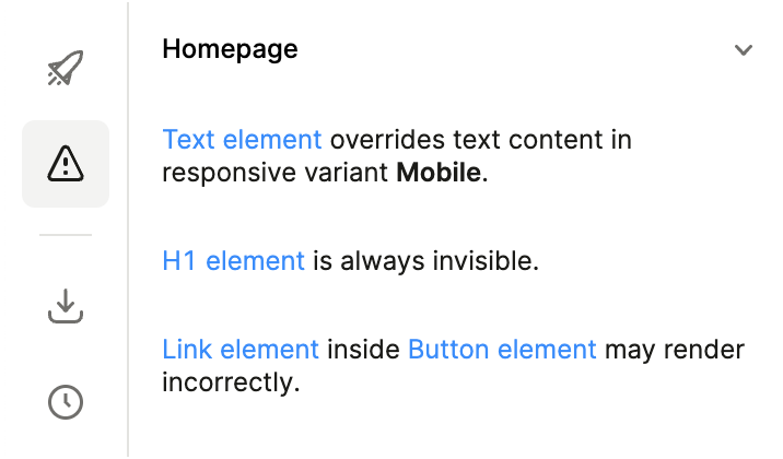
Project issues reporting
Plasmic offers lots of freedom and expressivity, but it also tries to guide users toward creating high-quality, fast, beautiful experiences.
To help you avoid certain common mistakes, we’re introducing a new left sidebar tab to list warnings and errors detected in the project.
Included in this initial release:
Find invalid nested items, such as links within links or headings within paragraphs (hydration errors).
Ensure responsive variant overrides are limited to styling only, to avoid flashes of incorrect content.
Find items that are never visible, to minimize page weight.
Element actions (code components)
You can now specify “element actions” on code components. These are specific custom actions that can be taken on an instance of the component, available when creating interactions.
For instance, if you inserted a Form, you can now find element actions to reset, clear, and update the form:
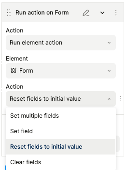
To define these for your own components, set refActions in your registerComponent calls—learn more in the reference docs.
And more
Plasmic hosting now supports configuring both www.example.com and example.com appropriately with redirects.
We now have more examples of code bases using internationalization including react-intl, lingui, and i18next
Docs for custom auth integration have been revamped, with example repos showing Supabase Auth integration
Now go play with all the new goodies!