New: Plasmic Customizable Components!
More flexible than ever before!
We’re excited to announce that the Plasmic Customizable Components are now available to everyone!
We’ve learned a lot from our previous design systems, Plume and Ant Design. Users enjoyed the customizability of Plume and the robustness of Ant Design, and we’ve worked hard to combine the best of both worlds. The new components are both fully customizable AND robust. Plus, with the tokens and presets.
To get started with the new components, follow our simple installation process.
Here’s what you can look forward to with this initial release:
Greater Accessibility: The new components are based on react-aria which allowed us to align more closely with accessibility standards for a better user experience.
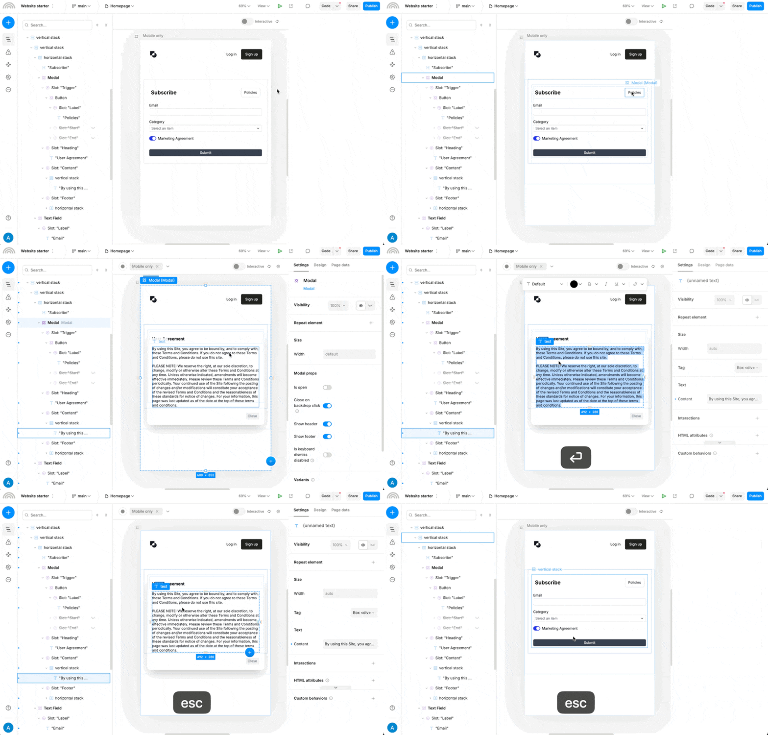
Enhanced Flexibility: A more granular component structure makes it easier to adjust and refine designs without resorting to code.
Smoother Workflows: With fewer initial setup steps, you can dive right into the creative aspects of your project.
Keep in mind that this is just the starting point. We see the Customizable Components as a foundation we’ll continue to build upon — adding new components, refining existing ones, and evolving with your feedback. If there’s a component or feature you’d like to see introduced, let us know in the comments or in the forum. Your input will help shape the system as it grows.
For more details take a look at our documentation. You’ll find everything you need to work with the new components, whether you’re starting fresh or updating an existing project.
Thanks for being part of the Plasmic community. We’re looking forward to seeing what you create next!

