Stateful code components, and new code component props
Tutorial on creating your own interactive Plasmic components
In our last issue, we announced the release of interactions and state in Plasmic Studio, letting you easily create rich, complex experiences without code.
In short order, the prolific Mr Biscuit from our community has published a great in-depth video on how to create your own components directly within Plasmic Studio that are interactive with state, all without code—check it out!
Code component state
Now, you can register your own code components with state as well. As is always the case with Plasmic, you can tear down all the walls when integrating your own codebase, bridging code and no-code.
This enables Plasmic Studio users to easily create interactive experiences using these code components.
For example, here is a table component that exposes the currently selected row as state, which we’ve connected to some form fields:
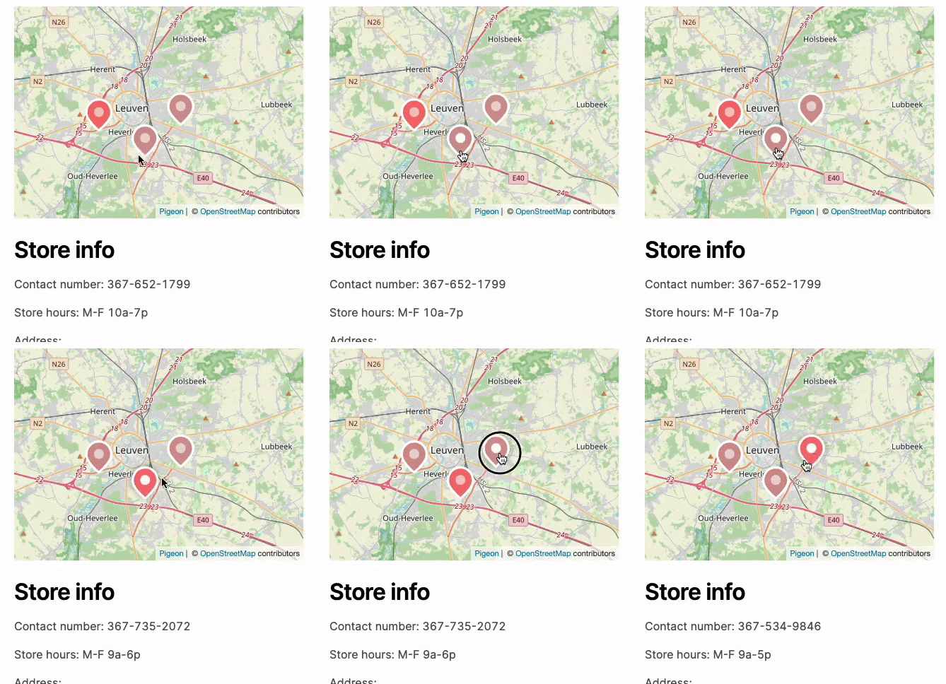
Or a custom map component that exposes the currently active marker as state, which we’ve connected to some text below it:
To learn how to register state for your own components, check out the in-depth docs!
New code component props
We also have some general improvements to code components, starting with code component props.
You can now add a prop of type list, with sub-fields on it to allow adding multiple entries of something:
You can also add nested object props—helpful for the above lists, and for tucking away nested settings behind a prop:
You can also add color props:
You can also add rich text fields to your components as well.
The code component reference docs have been updated with the newly available types.
Exposing advanced styling options for your code components
Previously, if your code component takes in a className prop, users of your code component can specify pretty much any style they want to apply to the root of your component. This was both too broad (it may not make sense to specify typography styles on your component) and too limiting (you may want to style specific parts of your code component, not just the root element).
We’ve introduced some new knobs to give you more control over how you want your users to style your code components!
First, when you register your component, you can specify which styleSections should be available:
registerComponent(MyComponent, {
  name: "MyComponent",
  props: {...},
  styleSections: [
    // user can only alter sizing and layout styles
    "sizing", "layout"
  ]
});
Check out the list of styleSections you can use here.
You can now also register props with the class type; users can specify styles for that class prop, and your code component will receive a css class name that you can put onto any part of your component, allowing your users to style specific parts of your component. You can even let your user target selectors like :hover!
function Counter({ className, countClassName, buttonClassName }) {
  const [count, setCount] = React.useState(0);
  return (
    <div className={className}>
      <div className={countClassName}>{count}</div>
      <button className={buttonClassName} onClick={() => setCount((c) => c + 1)}>
        Increment
      </button>
    </div>
  );
}
registerComponent(Counter, {
  name: 'Counter',
  props: {
    buttonClassName: {
      type: 'class',
      selectors: [
        // Plasmic Studio user can also in addition style the button's
        // hovered and pressed state
        {
          selector: ':hover',
          label: 'Hovered'
        }
      ]
    },
    countClassName: {
      type: 'class',
      // We can limit what kind of styles can be applied to this element
      styleSections: ['typography']
    }
  }
});
Check out the documentation on class type here.
Finally, if your code component is rendering content outside of the normal DOM tree — say, in a React Portal — and you want that content to have the same default styles or use the style tokens you’ve defined in Plasmic, you can now register a themeResetClass prop, which will receive a css class name that you can put at the root of your Portal-ed element. Check it out here.


