
Style variants, page templates, find/replace usages
Style variants, page templates, find/replace usages

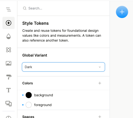
Style variants: responsive and dark mode styles
A long-awaited request: you can now define tokens (such as colors and spacing) and default styles (such as plain text, links, h1–h6, etc.) for different responsive breakpoints.
You can also define tokens for different global variants, such as dark mode or different themes/brands!
With this capability, you can easily make your design vary its appearance across different contexts just by defining a few core tokens and adjusting them in one place.
To set these, go to the Style Tokens tab or the Default Styles tab, and you’ll see a dropdown at the top that lets you choose what you want to target.
Insertable page templates
We recently added a slew of new example templates, featuring both standalone pages and complete sites built in Plasmic, from commerce to SaaS to agency to personal.
But no longer do you have to start a brand new project to use these. You can directly insert the templates as new pages into your existing projects.
You can now access these simply whenever you add a new page:

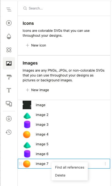
Global find-usages and global component swap
You can now find all uses of anything in a Plasmic project. Find all usages of any style token, mixin, image, icon, or component! You can do this by right-clicking the corresponding item from its respective left sidebar tab:
You can furthermore replace all instances of a component with a different component. This will attempt to preserve all slot, variant, and prop settings by name!

And more
The component store now features Tabs from the Ant design system.
Now can specify various code inputs as code component controls.
Turning elements into links is now much easier - can now right-click an element and select “Convert to link”